
HOME
ABOUT
WATERCOLOR
GOUACHE
MIXED MEDIA
CLASSES
CONTACT
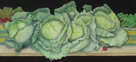
Watercolor
Gouache
Mixed Media
When people hear that I work primarily in watercolor, they often say, “Isn’t watercolor hard?” I usually explain that all media require certain techniques (and much practice) and that watercolor is no different. The image changes with how much water one adds to the paint, and whether one applies the paint to a wet or dry surface. The choice of paper, paint, and brush also influences the result. In addition, the surface of many watercolor papers is fragile, and erasing pencil lines before painting can cause defects.
I use 300 pound cold press paper, preferring those made by Lana-Aquarelle and Fabriano. The Fabriano paper I use comes directly from Italy- it is not distributed here in the United States, and I am fortunate to have access to it. Cold press paper allows the best absorbency for my technique. I generally use round brushes, and I really like the Golden Fleece brushes sold by Cheap Joe’s. I use professional grade watercolors which come in tubes, and I have paints from a myriad of companies including Winsor-Newton, Maimeriblu, Rembrandt, Holbein, Schmincke, and Sennelier. I love the paints made by Daniel Smith, but I find them expensive and only order them when I need a special color only they make, and when they are having a sale.
When I start a painting, I usually make several thumbnail sketches. After I decide on the structure of the painting, I do a full-size drawing on drawing paper. Since many of my paintings are complex, I do not want to damage the surface of the watercolor paper by erasures. When I am satisfied with my drawing, I transfer the drawing to the watercolor paper, using graphite paper. The watercolor paper has been taped down with masking tape on all four sides on a piece of solid Styrofoam. I often purchase the foam in the insulation section of a place like Home Depot. It comes in longish pieces (about 6 feet) which are about 30 inches wide. I cut them to the right size with a mat cutter. Other boards can be used, but one should use one that is made of a non-absorbent material, such as Styrofoam or other plastic.
I decide on my palette, which means selecting the colors I plan to use in the painting. Some people use plastic watercolor trays, which are available in many art stores. If you purchase one, make sure to buy one with at least 24 wells for the paints, and which has a cover. I have so many paints that I now use large 10-inch plastic plates and bowls for each painting. One plate might hold the pinks and reds, while other ones hold the greens, blues, or browns. Watercolor does dry out on the plates, which might affect the color. One needs to use fresh paint for some techniques.
Watercolor is a transparent paint, and I believe it looks best when it is applied in layers. Many of my paintings have six or more layers, which creates depth and volume. I tend to work on dry paper and let each layer dry before adding another. I always try to understand what mood I am trying to convey, and the use of lights and darks, as well as shadows, helps create that atmosphere. Most of my paintings are not of the “wet on wet” variety in which paint is applied to a wet surface, although many of my students prefer that technique.
Every artist has changing interests and moods. It is always fun to experiment with new subject matter and techniques. For example, my husband and I have traveled to France several times in recent years. We adore Provence, and I created a series of watercolors from our travels. Some are paintings of beloved villages, while others explore the local markets and vineyards. I’ve included some of these paintings on this web site.
I also love the wonderful local gardens of New England, and have begun to paint them from my own personal perspective. I’ve included a couple of these imagined gardens, complete with butterflies. Notice that in the painting “Summer Garden with Friends”, flowers that normally bloom in either the Spring or the Summer are all blooming at the same time. Some of the butterflies are true to color, while others are invented.
I have painted animals, still lifes, landscapes, people, and many other subjects. If you are interested in purchasing any of the paintings shown or would like to talk to me about a commission, please email me through
the CONTACT link.
Gouache is an opaque watercolor paint. It is made with permanent pigment with the addition of a chalk compound that gives the paint its opacity. It is sold by several companies, which supply it in a myriad of colors. Winsor Newton is the best known company that manufactures these paints. When I first started using gouache, there were few colors available, and for many of those early gouache paintings, I made opaque paint by adding either white or black gouache to watercolors.
In its form for children, gouache is sometimes called tempera paint, but the paint is thinned out and there is little variety in both pigments and paints. Tempera, sometimes called poster paint, should not be confused with egg tempera or egg emulsion, which are paints made from permanent pigments with the addition of a whole egg (for emulsion) or just the egg yolk (for tempera). Egg tempera and egg emulsion are ancient paints which are considered professional grade.
Gouache is generally applied to stretched watercolor paper. It can be used traditionally, like watercolor. One can work wet-on-wet (the paper is wet before applying the paint) or one can use a dry technique. If a painter adds a lot of water to the gouache, it can look a lot like straight watercolor. It is when it is used with minimal water that it achieves the opacity that many desire.
I developed a stylized painting technique using gouache paint. I use the paint so that it is quite opaque, and I neither work wet-on-wet nor use a blended technique. Blending is when the artist mixes colors on the paper by blending the paints. This is done to achieve either a smooth color gradation, or to create mood with shadows. In my technique, instead of creating volume and depth through shading or brush strokes, I apply the paints to each chosen area in a flat way. Each area, whether large or small, gets one color, without shading or texture. In this way, I achieve a gradation of color and/or shadow gradually, producing color changes as well as lights and darks to create distance and mood. Looking
at “Vermont Farm,” one can see how the foreground has more intense greens than the receding background, thus creating perspective, space, and interest. In “Cooling Off,” I worked to create the ripples around the tiger by painting colors in uneven spaces and patterns, which became darker as they receded from the tiger. What is important in this technique is the flatness of the paint application.
In the past few years, a new paint has become available. It is called Acryla, which is an opaque acrylic paint. Both watercolor and acrylics are water based transparent paints. The difference is that watercolors are made with water based binders such as Rabbit-Skin glue and Gum Arabic, while acrylics use acrylic binders. The benefit of the Acryla paint is that it is permanent, so that if one wants to change color or value, it is easier to overlay the earlier application. However, all acrylic paints dry very rapidly, and some people prefer watercolor or gouache, which can dry more slowly. In addition, the color range in Gouache is both more extensive and perhaps of higher quality. Even so, many artists are moving from gouache to Acryla.
Those who know me are aware that I have a long history of vision problems. My two eyes do not fuse, but since this is how I have always been, I experience volume and depth using other cues. However, I know that my eyesight is unique as an essentially one-eyed person. Perhaps because of my unusual vision, I enjoy experimenting with sculptural effects, and I’ve included some examples of this work.
I initially decided to experiment with cut paper. I used 300 pound cold press Lana-Aquarelle paper for both the base and the cutouts. I cut shapes with both a scissors and a mat knife, and used both Tacky Glue and Elmer’s Glue. “Bell Ringer on a Farm” was an early construction and I just used the cut paper, adding no other color. I added color (gouache) in both “Underwater Odyssey” and “Underwater Fantasy.”
I enjoy working with volume created by building up layers of sculptural materials. In “Blue-Eyed Elephant,” I used paper pulp. I started with a special paper called Linter, and soaked it in water to release the pulp. Then, I mashed up the released pulp and added some glue for binder. Some people prefer to put the Linter paper in a blender with water and a binder. I built up the elephant in layers on cut out 300 pound watercolor paper. After completing that phase, I colored the elephant with silver and black acrylic paint, leaving the tusks white, and adding blue marbles for the eyes. The entire elephant was mounted on a board that had a brown piece of rice paper dry mounted on it.
“Golden Elephants” was created by building up layers of Antique Gesso on a board. As it dried, I was able to add texture and color. I used gold leaf on both the elephants and the background. The upper background was a patterned gold leaf, available online through any gold leaf supplier.
The idea for “Sunflowers” originated when I was given a bouquet of sunflowers a few years ago. I placed them in a line on my driveway so that they would overlap and then I photographed them. I worked from these photos, first drawing them on water color paper and then, cutting the whole shape out with scissors. I painted them with acrylic and added sand to the paint to make the center look like seeds. After that, I created shadows with dark paint. The entire cut-out and painted work stands alone and I hang it directly against a wall.
“Elissa’s Chimp” was created using air-hardening clay. I used Styrofoam for an armature and slowly built up clay. When dry, I painted it with acrylics and varnished it. Incidentally, I made the sculpture for my daughter, Elissa, who is a primatologist, and studies all primates, including apes and monkeys.
“Madagascar Chameleon” is probably one of the more complex constructions. Again made with Elissa in mind (she has been to Madagascar twice to study lemurs), I used a variety of sculptural materials including the paper pulp and antique gesso, and I constructed it on paper. After painting the chameleon a deep green in acrylics, I then collaged small squares of paper cut out from magazines and organized in folders by color. I varnished the Chameleon and mounted it on an abstracted leaf which was prepared by covering it with multiple layers of tissue paper and varnish.
Recently, I started working with Egg Shell Mosaics. I envisioned a whole wall representing an underwater scene. So far, I have had three fish cut out of wood, and I painted them with black acrylic. I then painted many white egg shells (empty) with acrylics in a myriad of colors and, broken into tiny pieces, put them into a plastic box with many dividers. I glue the egg pieces (again with either Tacky or Elmer’s) on the board using toothpicks and Q-Tips, thus creating a mosaic. After each fish is completed, it is polyurethaned. “Fantasy Fish” is an example.
My ideas are always evolving and, for me, the creations of 3D art are unique and exciting. I’m sure it is evident that I enjoy the natural world, often taking my ideas and images from flowers and animals. My background in biology as well as both growing up with a scientific father and now living with a gifted and endlessly curious engineer, has helped encourage me and enrich my life.
Gouache
Mixed Media